Grain Mobile App Design Concept
Background
Grain is a unique, online lunch delivery service that aspires to be the Uber of healthy food in Singapore. Customers place orders and pick their preferred time and location for lunch delivery, which is prepared on-demand at Grain’s kitchen on the same day. I did a 2-month long freelance project from Feb 2016 to April 2016, and worked alongside Grain’s co-founders and developers to re-design parts of the online delivery platform, as well as to come up with a design for an iOS app for making food orders.
Target Audience:
Busy, office workers in the CBD
Companies, corporates
Health-conscious foodies
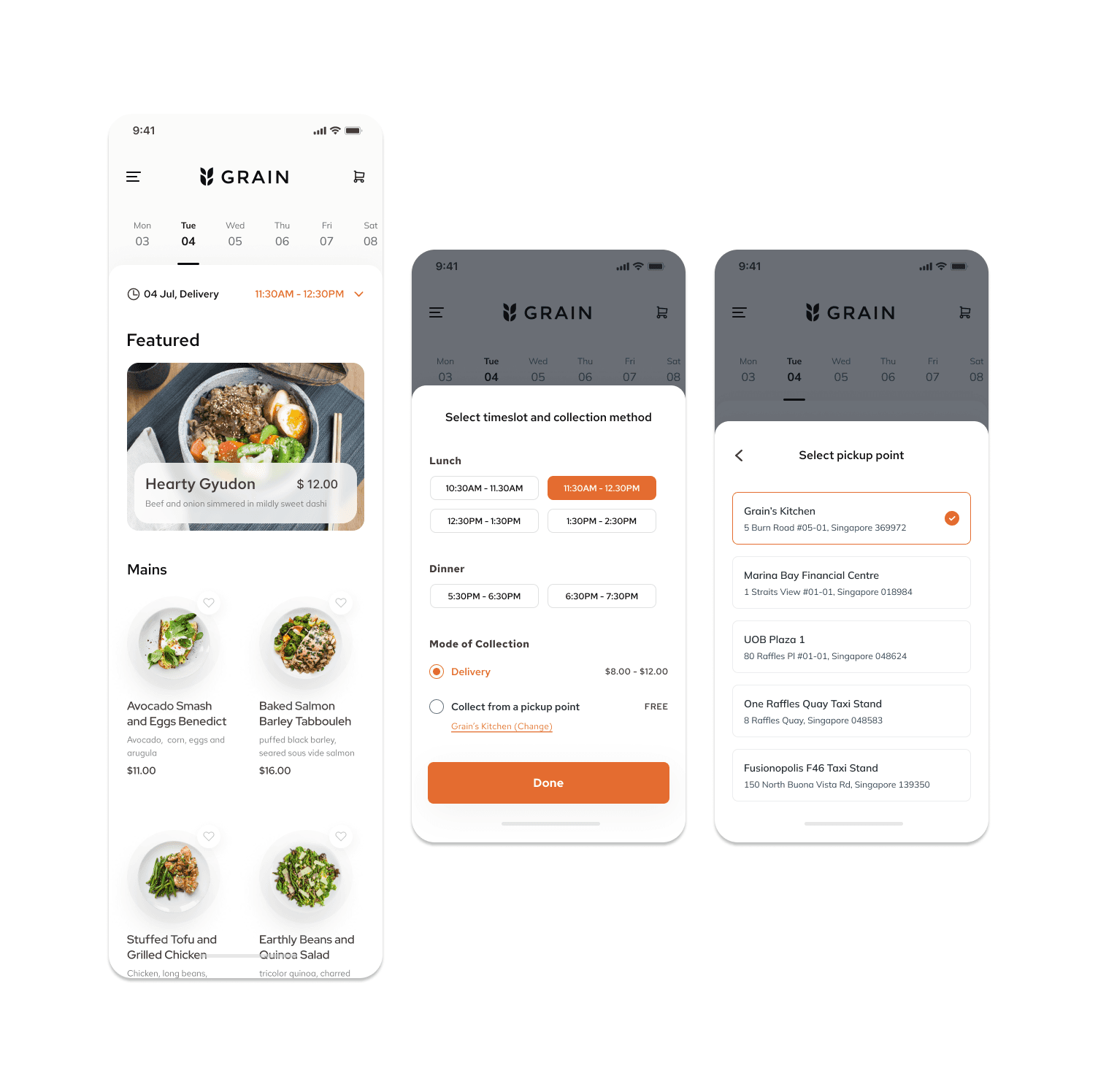
Mobile App Design
While Grain currently does not have a mobile app, I created a series of screens to envision what my favourite food experience product could look like. I did not want Grain to come across as another food delivery app, as it markets itself as as online restaurant with its own unique offering of dishes. I tried to give the app a minimalistic look, in lined with Grain’s branding.
I also wanted to make sure that it was easy enough for the users to select their desired date and timeslot, along with their preferred method of collection (delivery or collection via a pickup point). The dates were easily selectable on the top to show customers Grain’s menu for lunch and dinner on that day in advance.
Grain prides its conceptualisation and presentation of their own dishes and I wanted to make sure that the dishes also look appealing on the app and emphasis on its dish’s writeup, as well as its nutritional information and ingredients prepared by their chefs.


Apart from the dish presentation, I also proposed some ways to entice customers into ordering sides (desserts and drinks) to meet the minimum spending value to reduce their delivery fee, as well as promote Grain’s side offerings. Since Grain’s menu is quite small (only 4 to 5 main dishes per week) and considering how most users’ priority in ordering are not the sides and drinks, I felt that it would be a good way to suggest side dishes for customers to pair their meal with and add it to their cart. A small, but not too obtrusive, progress bar was added to the top of the menu screen and cart screen to nudge users into adding more items into their cart to reduce their delivery fee, if they had chosen delivery as their method of collection.

