Grain is a unique, online lunch delivery service that aspires to be the Uber of healthy food in Singapore. Customers place orders and pick their preferred time and location for lunch delivery, which is prepared on-demand at Grain’s kitchen on the same day. I did a 2-month long freelance project from Feb 2016 to April 2016, and worked alongside Grain’s co-founders and developers to re-design parts of the online delivery platform, as well as to come up with a design for an iOS app for making food orders.
Target Audience:
- Busy, office workers in the CBD
- Companies, corporates
- Health-conscious foodies
The Task
I was given 2 assignments during my brief stint at Grain. Firstly, I had to come up with UI improvements to Grain’s existing order form on their web application, and secondly, to come up with a mobile app design for customers to browse the daily menu place food orders on demand.
Any form design ought to be simple and intuitive to the user. The ordering process should also ultimately be fuss-free.
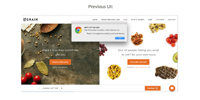
Less Pop-Ups
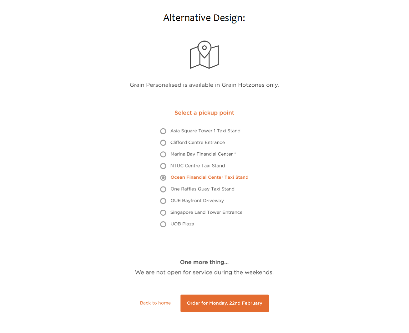
Previously, when a user visited the food customization page (called Grain Personalized), a dialog would pop up to notify the user that Grain is only available in hotzones if the user’s current address is not any one of the pickup points. Instead of a pop-up window, I felt that we could allow the user to choose a hotzone before activating the Grain personalization form.
This is the alternative I came up with to replace pop-up. I felt that if the user clicked on Grain Personalized and his address is currently nowhere near a hotzone, he should be allowed to select a pickup point easily, instead of having to navigate back to the account page to change the address. The selected pickup point could tentatively replace his current address for this personalized order.
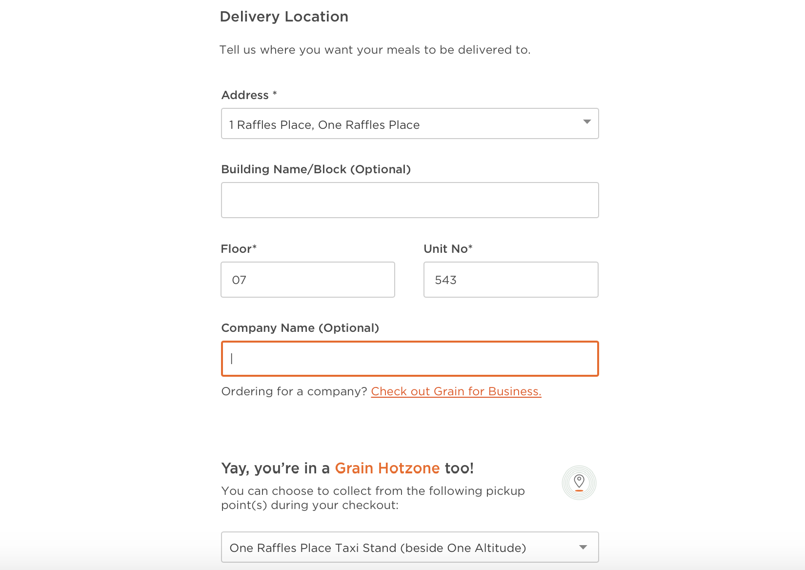
Delivery Address Input
As a user, I may want to select a hotzone (pickup point) without having to key in an actual address. My floor and unit number would also not be necessary if I just want to collect food from a pickup point.
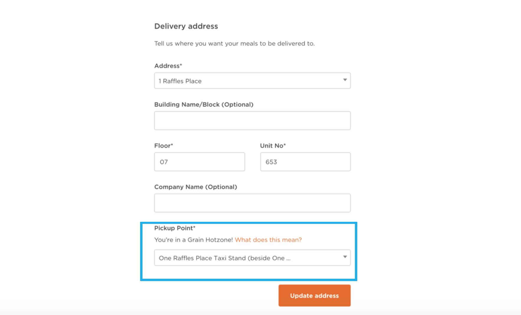
Prior to signing for for an account on Grain, I was aware that there are specific pickup points where delivery is free. So when I was asked to input my delivery address, I wanted to select a pickup point right from the start, but I had no idea how to. So I had to refer to the FAQ section to check the hotzones, and then key in a physical address to be able to select the closest pickup point. I felt that this part could be made easier for a user who is just interested in collecting food from a hotzone.
Instead, I felt that the user can either (1) choose a hotzone from a list or (2) enter a physical address. If the user chooses a hotzone, there is no need for him to enter floor and unit number, except for hotzones like Marina Bay Financial Center (to be elaborated further in the next page). If the user chooses to enter his physical address, it could just show the existing delivery address form.
This was the alternative design I proposed for getting the user to input their delivery address:
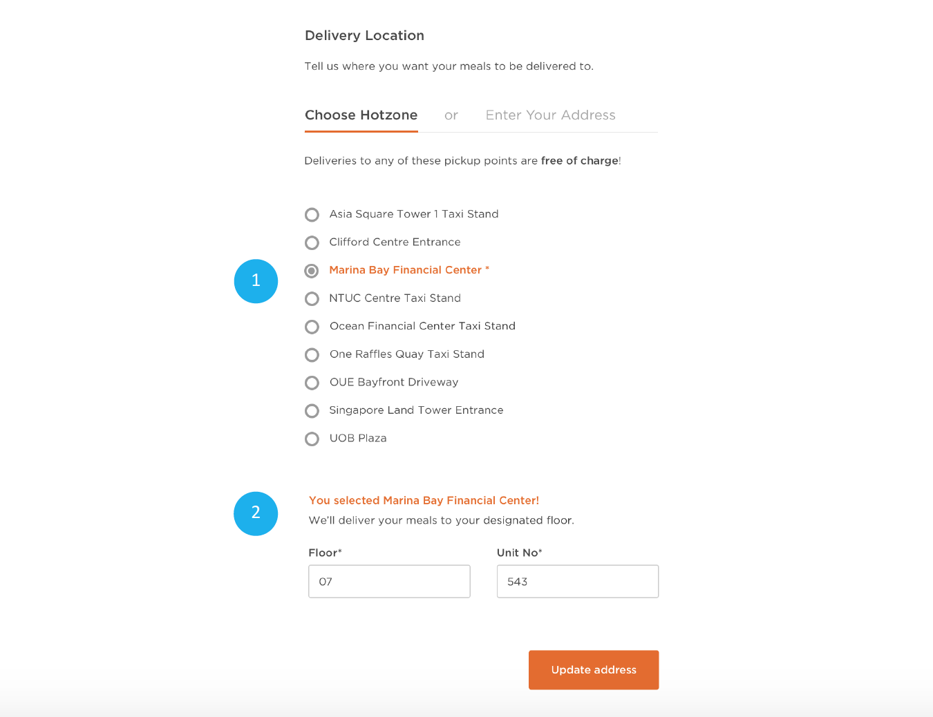
If a user (STEP 1) chooses a hotzone where food can be delivered to any floor, an additional form could appear below to allow the user to (STEP 2) input a designated floor and unit number.
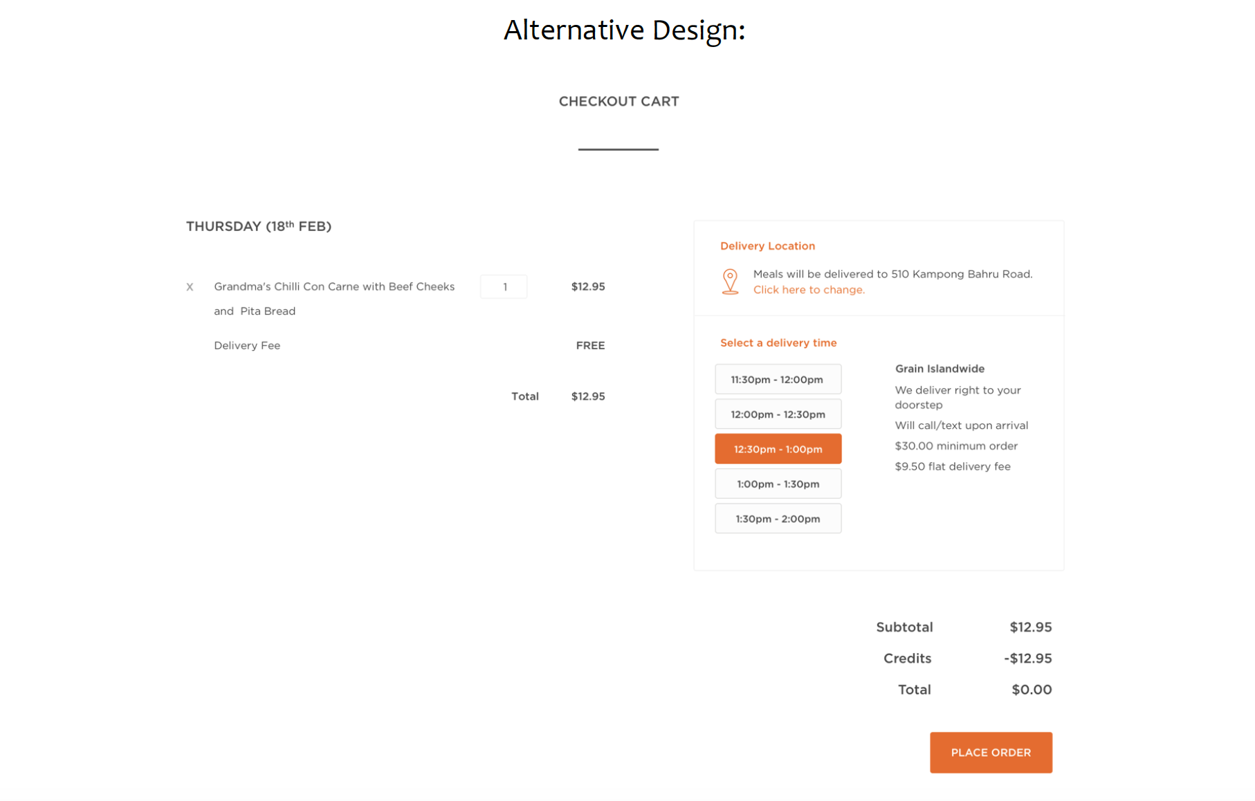
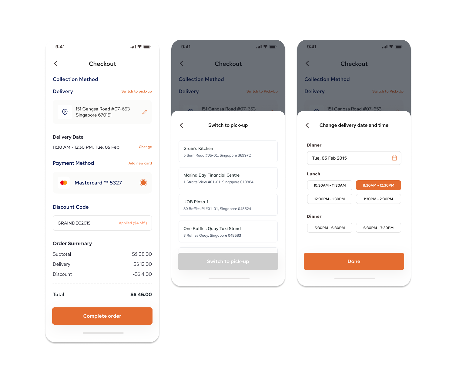
Checkout Page
Grain’s original checkout page’s design is relatively clean and simple enough for the user to select the delivery time too. However, the only way to remove an item from a cart is to type 0 in the quantity field, which may be a hassle for the user here. I also felt that the placement of the delivery location at the top of the order was not very noticeable, as I did not notice it until I scrolled to the top of the page again.
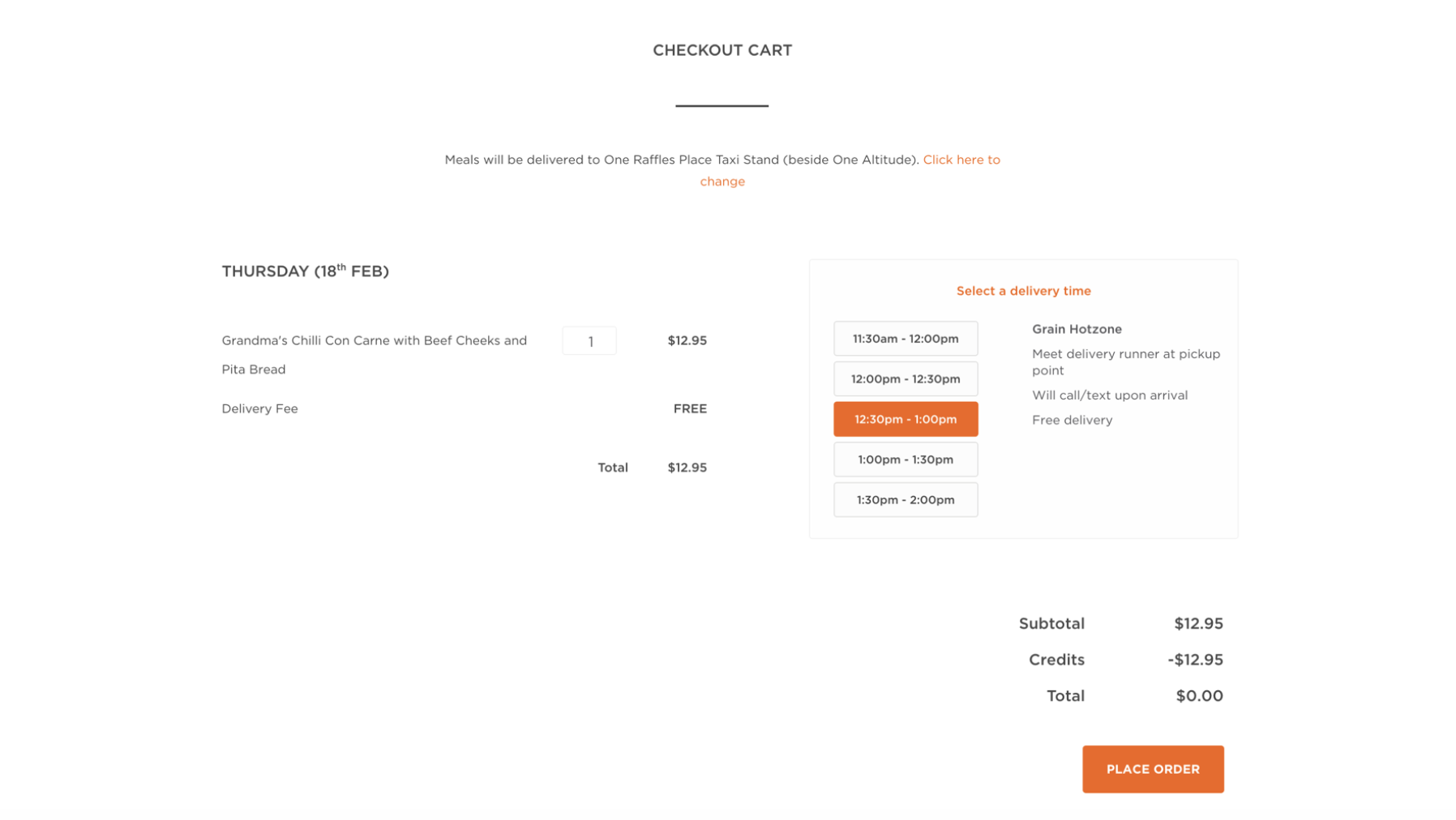
I felt that there should be an ‘x’ button next to the food description to make it easier for the user to remove items from the cart.
The text description about delivery location could also be shifted to the right of the food order details, instead of displaying it at the top. This would also fit the user’s natural eye movement, where attention moves from left (food description) to right (delivery and time) and then to bottom (total due), instead of having to look up again.
Address & Checkout Form Redesign
I also redesigned Grain’s address form to allow users to differentiate between the delivery and pickup option, and also to allow users in hotzone areas to still be able to choose the delivery option. I also wanted to find ways to encourage companies to check out Grain for Businesses when a large number of orders was entered during checkout.
I removed the field where users choose delivery or pickup as their mode of collection. However, if the user’s address happens to be within a hotzone, they will be alerted of nearby pick up points which they can choose during the checkout process.

In addition, I made some changes to the checkout form to allow users choose their preferred mode of collection for their orders during their checkout instead of in the address form. Users may also choose a different mode of collection for each day.
If the user’s address is within a hotzone, they would be able choose the mode of collection (either the delivery or pickup option) for different days. On the other hand, if the user’s address is not within a hotzone, then the default mode of collection would just be via delivery.
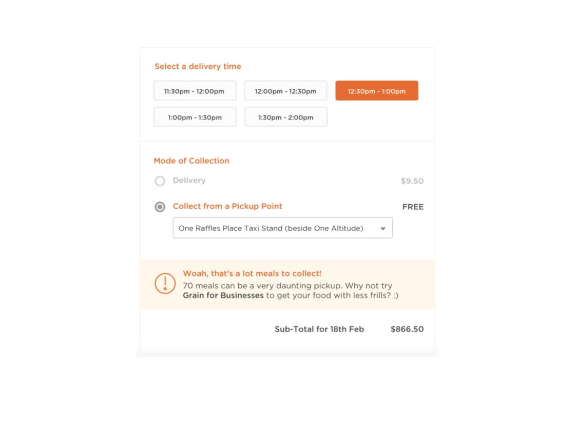
If the user orders a number of meals beyond a certain threshold (e.g. 70) and selects pickup as a mode of collection, a message could appear to suggest the user to try Grain for Businesses instead. This is because we wanted to try to discourage companies from exploiting the free pickup option when they place bulk orders.
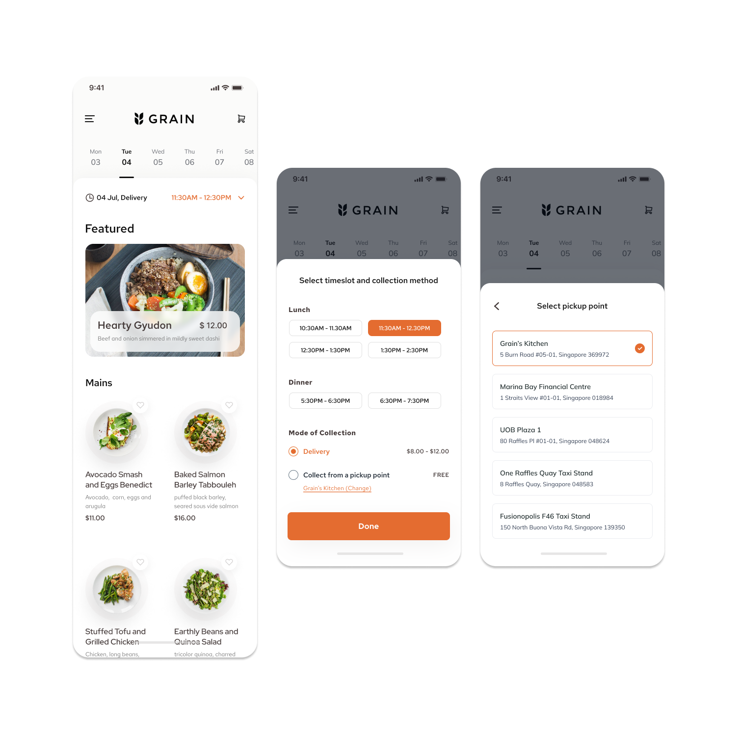
Mobile App Design
As part of my freelance project, I also proposed a mobile app design as a proof of concept. I was careful to make sure that Grain does not come across as another food delivery app, as it markets itself as as online restaurant with its own unique offering of dishes. I tried to give the app a minimalistic look, in lined with Grain’s branding.
I also wanted to make sure that it was easy enough for the users to select their desired date and timeslot, along with their preferred method of collection (delivery or collection via a pickup point). The dates were easily selectable on the top to show customers Grain’s menu for lunch and dinner on that day in advance.
Grain prides its conceptualisation and presentation of their own dishes and I wanted to make sure that the dishes also look appealing on the app and emphasis on its dish’s writeup, as well as its nutritional information and ingredients prepared by their chefs.
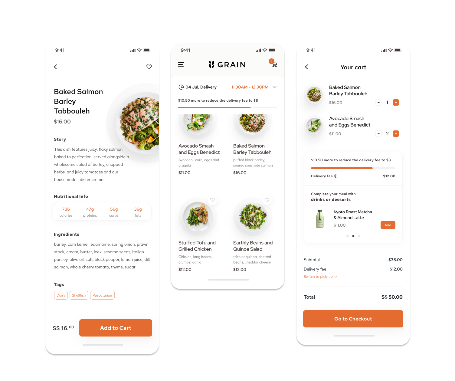
Apart from the dish presentation, I also proposed some ways to entice customers into ordering sides (desserts and drinks) to meet the minimum spending value to reduce their delivery fee, as well as promote Grain’s side offerings. Since Grain’s menu is quite small (only 4 to 5 main dishes per week) and considering how most users’ priority in ordering are not the sides and drinks, I felt that it would be a good way to suggest side dishes for customers to pair their meal with and add it to their cart. A small, but not too obtrusive, progress bar was added to the top of the menu screen and cart screen to nudge users into adding more items into their cart to reduce their delivery fee, if they had chosen delivery as their method of collection.