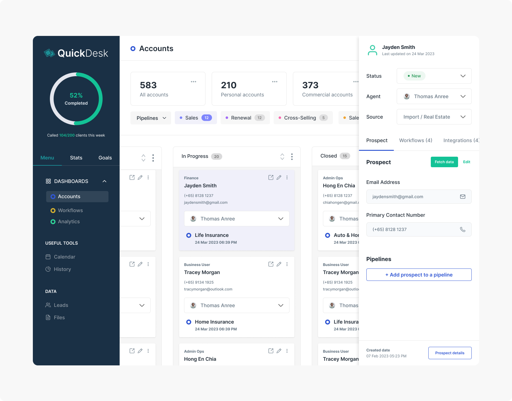
QuickDesk is a CRM application optimized for sales professionals and teams to manage their leads and close prospects easier than ever.
During my brief stint at PearComms, I helped create the user experience design of the web app. I produced the major deliverables and worked with my client between February 2015 and April 2015. I worked alongside the co-founders, marketing lead and 2 developers. I offered to updated the designs sometime again in 2022 with new components using the TailGrids component library, based off Tailwind CSS.
Target Audience:
- Salespeople (e.g. Insurance Agents, Property Agents and Marketers)
- Sales Teams
The Challenge
Salespeople communicate heavily with their clients and prospective leads on a regular basis, and rely on a large variety of tools such as Microsoft Excel, E-Mail, WhatsApp and other messaging services which can be quite disintegrated and inconvenient to keep track of. At the same time, salespeople can be quite averse to technological change. Introducing to our users a new tool aimed at increasing sales productivity and integrating communication services would also prove to be a daunting task.
The Task
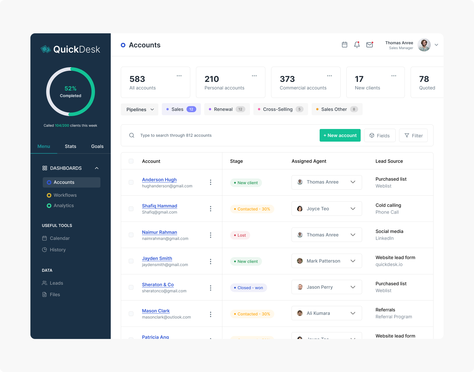
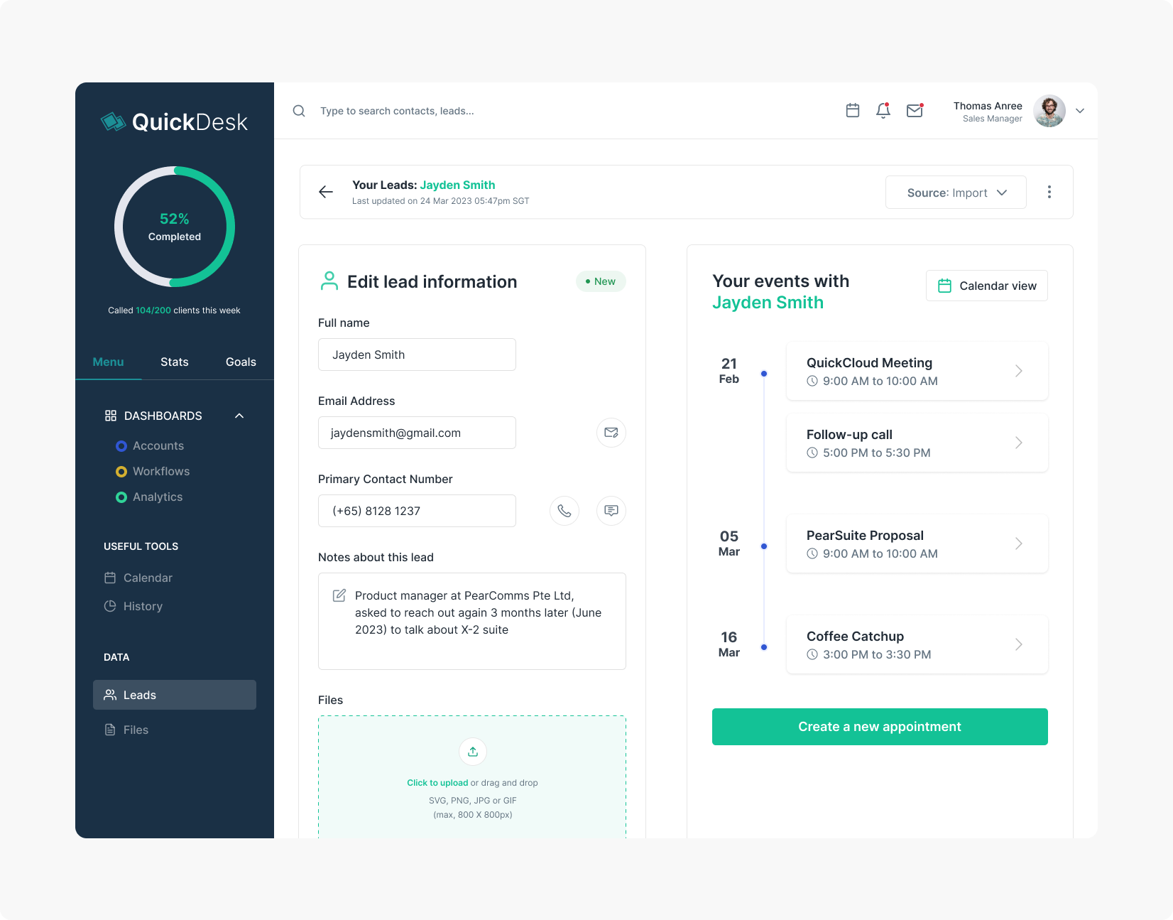
My assignment was to design a dashboard system that allows the user to manage and communicate with a large number of leads.
The user should also be able to track his progress in contacting and initiating follow-ups with his leads, and categorize each lead under a particular contact status (e.g. New or Prospect) from time to time.
Target Users
There are generally 2 types of salespeople – hunters and farmers. A hunter is one who opens new markets and focuses on customer acquisition, whereas a farmer spends their time cultivating existing customers to allow for even more sales, with greater emphasis on customer retention.
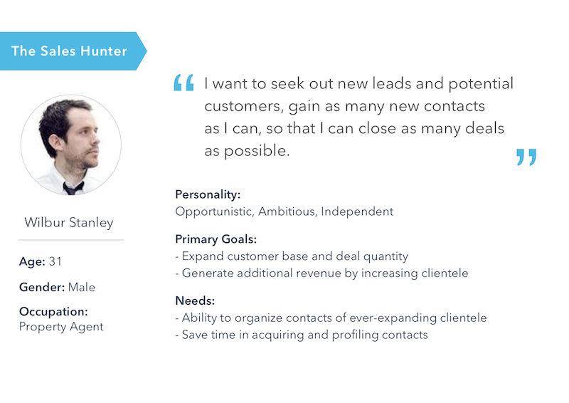
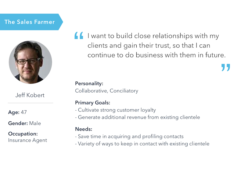
At PearComms, we wanted to build a CRM system that caters to both types of salespeople. It is also important to note that the distinction between a hunter and a farmer is not necessarily clear at all times. A salesman may be active in both roles. Our system has to allow hunters to organize and keep track of a growing number of leads’ accounts and, at the same time, allow farmers to communicate effectively with existing leads to maintain contacts and build relationships.
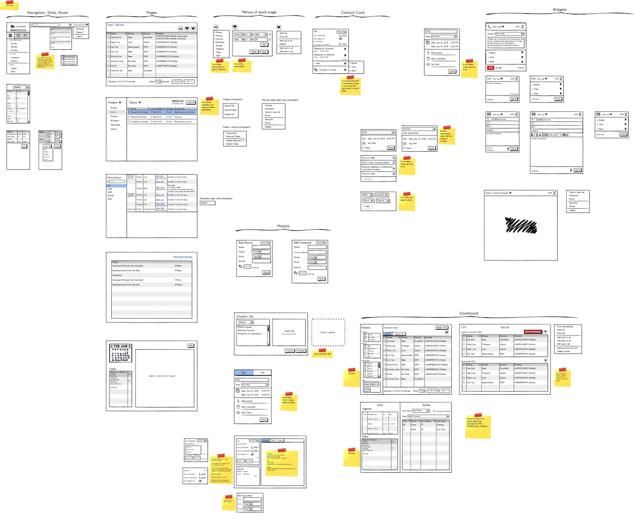
Wireframes
The PearComms team had come up with a master wireframe detailing the dashboard screens and contact cards. During my stint, I worked closely with the development team to clarify doubts and discuss about changes to the wireframes and process flows from one screen to another. I modified some of the wireframes to make some pertinent features more obvious to the users.
A suite for salespeople to consolidate their prospects and run marketing, sales
On an everyday basis, salespeople spend their time switching from one tool to another to manage their sales, communicate with their customers, run sales, dig analytics, and much more. QuickDesk aims to change this by bringing all these tools together in one platform, tailored specifically for insurance agencies’ workflows. My goal was to redesign and improve their flagship product.
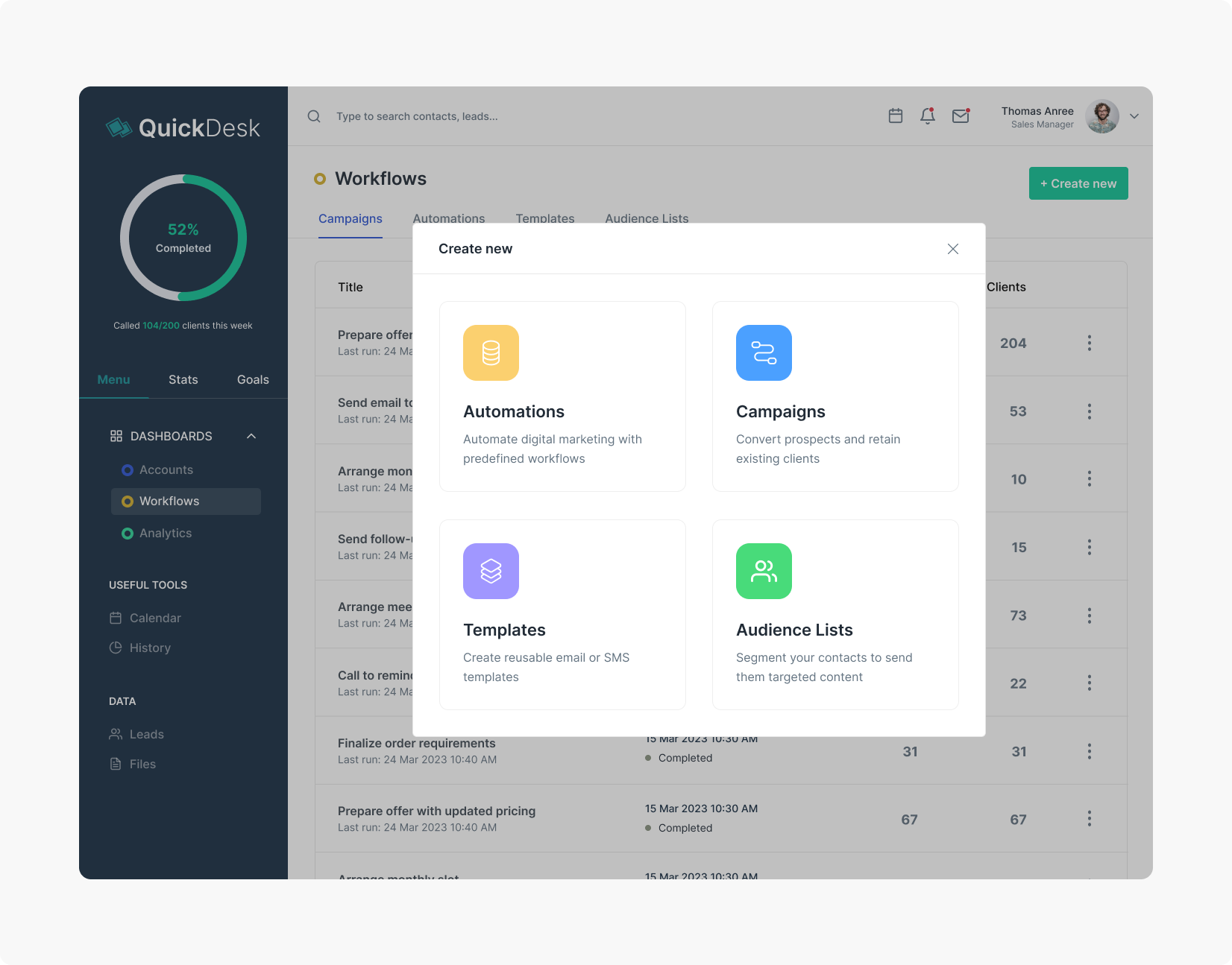
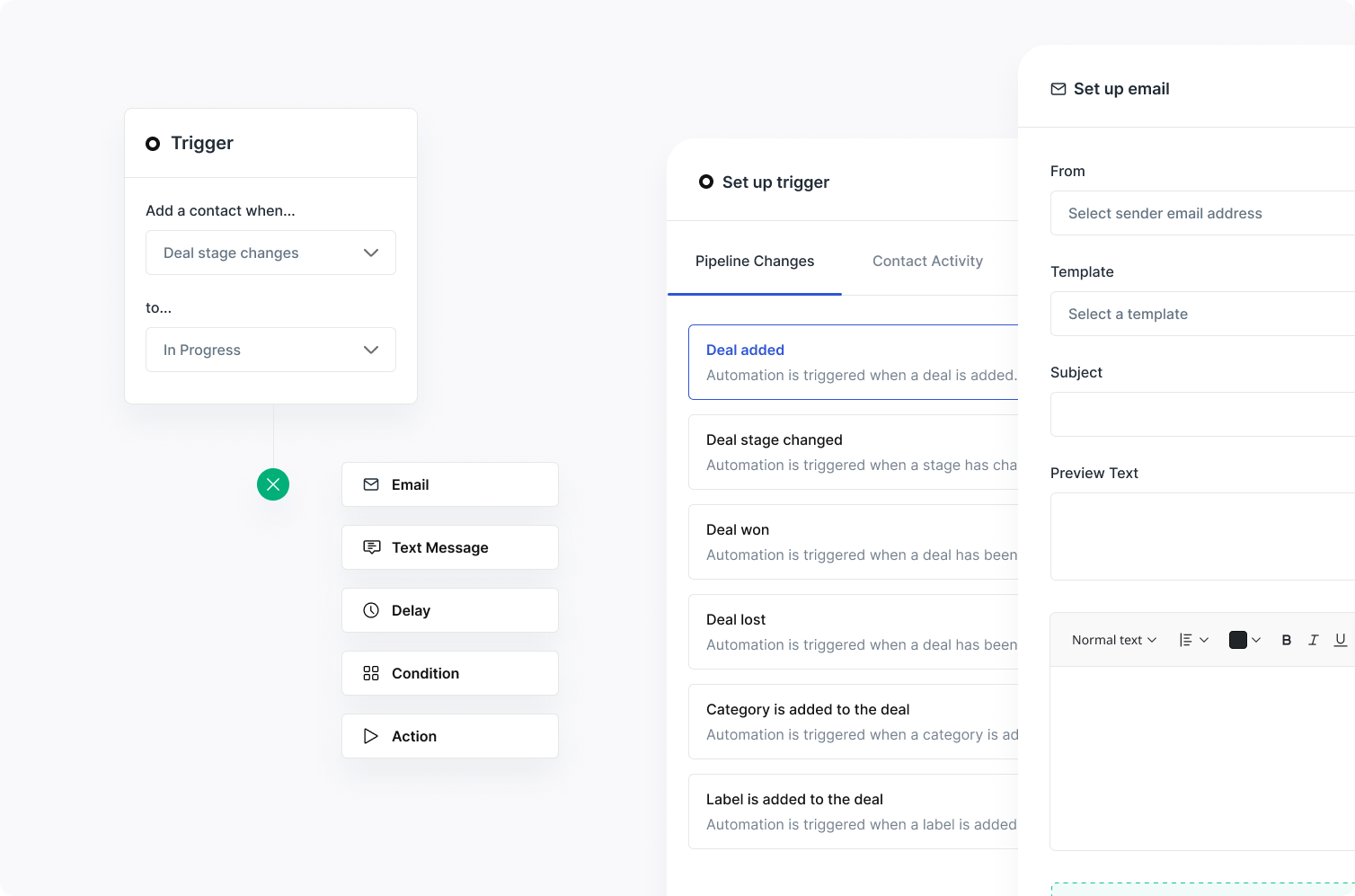
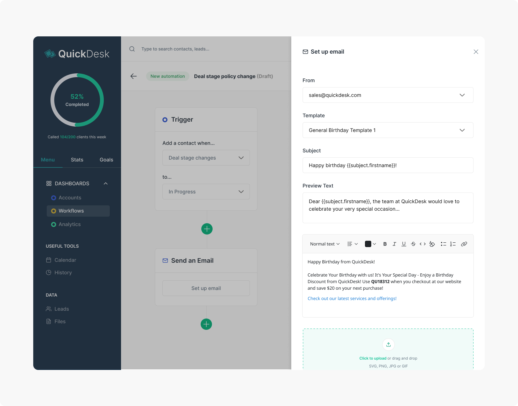
Marketing automations – one place for Multi-channel communications
To allow users to communicate with prospects and clients using e-mail and text messages as one communication stream, I helped designed an experience where both communication channels can be used inside one marketing campaign or marketing automation. My goal here is to help salespeople drive automated email and text messages to connect with customers when they are most ready to engage.
User Testing
Of course, design does not end here. After the stint, I continued to keep in contact with PearComms to occasionally discuss about minor changes to the design and feedback from users. As the team developed the web app over the next few months, the team also validated some of the dashboard concepts by conducting training and asking salespeople and potential users to test the web app. Sometime later in March 2016, I drafted a list of user scenarios PearComms could use to conduct user interviews and usability testing. I adapted some of these testing methods from Steve Krug’s Rocket Surgery Made Easy guide.
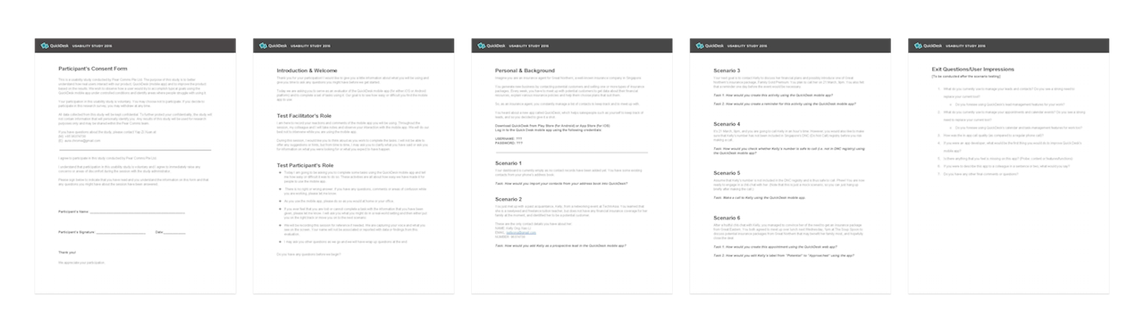
For instance, I learnt that salespeople, especially those from the older generation, have a relatively high resistance to change in tools, so the on-boarding process for new users ought to focus more in helping users to import existing contacts and calendar events to the app with greater ease. Some users were also uncertain if a particular contact was in Singapore’s DNC registry before attempting to make a call, so the process for Internet-calling ought to account for a step in checking and assuring users that a contact was safe to call beforehand.
Final Thoughts + Room for Improvement
My stint at PearComms was fruitful and exciting, albeit a short one. I learnt valuable design insights from the front-end developers and company advisors, who taught me more about the behaviours of salespeople. As the stint took place during my university term, I was not able to extend the duration of the stint due to pending academic deadlines and exams. (I was a really kiasu student who took grades seriously.) If I could revisit the app design in future, I would attempt to address the problems of inactive usage among older groups of salespeople and design collaborative elements for sales teams, and not just individual salespersons, to manage shared leads and prospects.